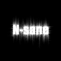
Step 1- Vertical Line
Create a new image. For this tutorial, I used 500x500. Fill the background with a dark color. I used #1b1b32.
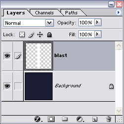
Create a new layer then double click on that layer, and name it blast.
Create a vertical line on the blast layer by using the Rectangular Marquee Tool (M or SHIFT + M). My line was 50x500.
Fill the selection by setting your forground color to white (you can press D to reset to default colors). Then press ALT + BACKSPACE
Fill the selection by setting your forground color to white (you can press D to reset to default colors). Then press ALT + BACKSPACE
Deselect by pressing CTRL + D
 Step 2 - Spikes
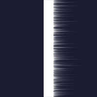
Now we add the spikes.
Filter » Stylize » Wind » [ Method: wind Direction: From the Left ]
Repeat the last filter 2 more times by pressing CTRL + F twice.
 Step 3 - More Spikes
Spikes on the other side.
Filter » Stylize » Wind » [ Method: wind Direction: From the Right ]
Repeat the last filter 2 more times by pressing CTRL + F twice.
 Step 4 - Motion Blur
Add a little blur.
Filter » Blur » Motion Blur [ Angle: 0° Distance: 20 pixels ]
Filter » Blur » Motion Blur [ Angle: 0° Distance: 20 pixels ]
Play with the # of pixels to get different effects
 Step 5 - Polar Coordinates
Rotate the Blast Layer by pressing CTRL + A to select all, then CTRL + T to enter transform mode, then right click on the layer, and select Rotate 90° Clockwise, then press ENTER to apply the transform.
Now would be a good time to copy the blast layer if you want more then one blast ring. You can do this by pressing CTRL + J to duplicate the current layer, then click the eye icon next to the dup layer to turn it off for now.
Now we need to bend this into a curve. Make sure you have the blast layer selected,
Filter » Distort » Polar Coordinates [ Rectangle to Polar ]
 Step 6 - Color Dodge
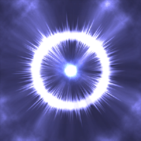
Next set the fill mode to Color Dodge and the fill to 80%.
You should have a nice little blast ring now, and just need something to put below it and then just tweak the fill percent on the layer to get exactly what you want.
Well this in its self, is not all that impressive, so lets go on to the next section where I will show you how to spice it up a bit.
 Step 7 - Sun Layer
Create a new layer above the other layers and name it Sun. Fill it with black, by pressing D to reset your colors, then ALT + BACKSPACE to fill with your foreground color. Set the blend mode to Color Dodge.
Filter » Render » Lens Flare [ 105mm Prime, Brightness: 100%]
Make sure your Flare Center is in the center, or as close as you can get it.
 Step 8 - Energy
Create another new layer below the sun layer, and name it energy.Set this layers blending mode to Color Dodge.
Filter » Render » Clouds
Filter » Distort » Pinch [100%]
Repete the last filter two times by pressing CTRL + F twice.
 Step 9 - Chrome
Copy the energy layer by pressing CTRL + J
Filter » Render » Lighting Effects
Colors: White
Light type: Omni
Intensity: 14
Gloss: 65
Material: 96
Exposure: 30
Ambience: -8
Filter » Sketch - > Chrome [ Detail:4 Smoothness:7 ]
tip: you can play around with the numbers on both the Lighting Effects, and the Chrome filters to achieve different effects.
 Step 10 - Levels
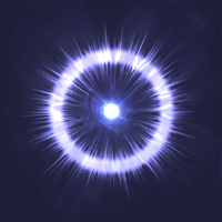
Now we just make the whites a little whiter by using Levels
Press CTRL + L to bring up the Levels.
Slide the sliders around untill you get the amout you want. I used 25, 1.00 133
You should have a pretty nice looking energy blast effect.
 Step 11 - Play around
This is a very fun tutorial to play around with and create endless possiblilities. Try these on your energy copy layer:
Filter » Render » Lighting Effects
Colors: White
Light type: Omni
Intensity: 14
Gloss: 65
Material: 96
Exposure: 30
Ambience: -8
Levels: 0, 0.55, 187 


 Step 2 - Outside Glow
  Step 3 - Small Lines
 Step 4 - Gaussian Blur
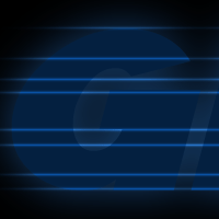 Step 5 - Medium Lines
 Step 6 - Large Line
 Step 7 - Outline
 Step 8 - Gaussian Blur
 Step 9 - The Darkness Inside
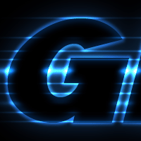 Step 10 - Motion Blur

 Step 3:
  Step 4:
 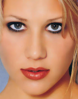 Step 5:
 Extra Tip #1
 Extra Tip #2
 Image preview:
 Take note of the following controls and how they work:
  You can now either click OK to apply the adjustments, cancel, or hold Alt. and click Reset to reset the slider positions. Now you know how to use Levels instead of the brightness/contrast function of Photoshop.
 Step 2:
 Step 3:
 Step 4:
 Step 5:
 Step 6:
 Step 2: - Vertical Wind
 Apply the Ripple Filter ( Filter > Distort > Ripple ) to make the light wavy.
 Open the Hue/Saturation window ( Image > Adjustments > Hue/Saturation ) and press Ok with the default values.
 Step 4: - Final Touches
 Click on the Gradient Tool and use the following setting shown in the image bellow:
 Step 2: - Creating Gradients
 Click on your foreground color square and add "50" to the "Hue" (ie. 0 -> 50, 50->100)
 Repeat this step until the Hue is 350. By the end of this, you should have an image like the one bellow.
 If your gradients are coming out too thick, try dragging less of a distance.
 Change the Blending Mode of layer "stripes 2" to "Difference".
 Step 4: - Finishing the Base
 Next, add a Plastic Wrap ( Filter > Artistic > Plastic Wrap ) with the settings used in the image bellow:
 Finally, to add more contrast to the flesh, duplicate the layer and change the Blending Mode to "Overlay".